Related Resources
The latest guidance and tools, training and learning materials, stories, monitoring and evaluation tools and Network publications

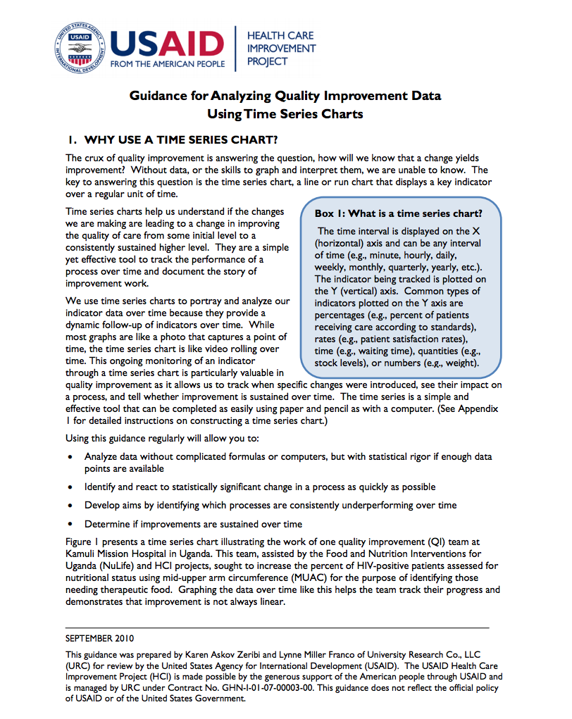
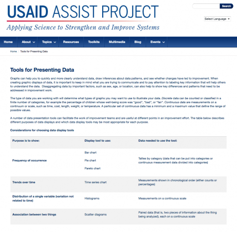
This short paper provides guidance on how to analyze and interpret time series charts. It describes the essential features of properly drawn and annotated time series charts, including calculation of the median when you have a minimum of 10 data points. Rules for detecting trends and shifts in time series charts are explained, which allow for greater statistical rigor in interpreting results. Actual time series charts from work supported by the USAID Health Care Improvement Project illustrate each concept discussed.
The latest guidance and tools, training and learning materials, stories, monitoring and evaluation tools and Network publications